Showing posts with label class. Show all posts
Showing posts with label class. Show all posts
Thursday, February 5, 2015
Creating EasyTooltip class Part 16
Today well add the ability to create bitmap fills and strokes for our tooltips.
First, create 2 new class files - BitmapRect.as and BitmapStroke.as. These are similar to the classes of the same name in the AdvAlert library.
BitmapRect.as code:
BitmapStroke.as code:
Go to TooltipCursor.as, find the updateDisplay() function. Create 2 new if..statements here.
The first one checks if style.backgroundStroke is an object of class BitmapStroke. Base this if..statement off the one that checks if the object is an instance of GradientColorStroke, just change lineGradientStyle() to lineBitmapStyle() and use the approporiate values:
The second if...statement checks if backgroundRect is an instance of BitmapRect class. Base this one on the if...statement that checks if backgroundRect is an object of GradientColorRect class. Change beginGradientFill() to beginBitmapFill() and use the new values:
Full class code:
Using bitmap strokes and fills is now as easy as it is to use gradients. In this example, I create 2 perlin noise BitmapDatas and set them as stroke and fill of the tooltip:
Thanks for reading!
The results:
Read more »
First, create 2 new class files - BitmapRect.as and BitmapStroke.as. These are similar to the classes of the same name in the AdvAlert library.
BitmapRect.as code:
package com.kircode.EasyTooltip
{
import flash.display.BitmapData;
import flash.geom.Matrix;
/**
 * ...
 * @author Kirill Poletaev
 */
public class BitmapRect
{
public var _bitmap:BitmapData;
public var _matrix:Matrix;
public var _repeat:Boolean;
public var _smooth:Boolean;
public var _radius:Array;

/**
 * Create a rectangle filled with bitmap. Has the same parameters as beginBitmapFill(), plus lineThickness, lineColor, lineAlpha and cornerRadius.
 * @parambitmap BitmapData to be used to fill the rectangle.
 * @parammatrix Matrix object for transformation.
 * @paramrepeat Repeat the bitmap when filling.
 * @paramsmooth Smoothen the bitmap.
 * @paramcornerRadius Radius of the corners of the box - top left, top right, bottom left, bottom right.
 */

public function BitmapRect(bitmap:BitmapData, matrix:Matrix = null, repeat:Boolean = true, smooth:Boolean = false, cornerRadius:Array = null)
{
if (cornerRadius == null) cornerRadius = [10, 10, 0, 0];
_bitmap = bitmap;
_matrix = matrix;
_repeat = repeat;
_smooth = smooth;
_radius = cornerRadius;
}

}

}
BitmapStroke.as code:
package com.kircode.EasyTooltip
{
import flash.display.BitmapData;
import flash.geom.Matrix;
/**
 * ...
 * @author Kirill Poletaev
 */
public class BitmapStroke
{
public var _lineThickness:Number;
public var _bitmap:BitmapData;
public var _matrix:Matrix;
public var _repeat:Boolean;
public var _smooth:Boolean;

/**
 * Create a bitmap filled line stroke. Uses same parameters as lineBitmapStyle() + lineThickness.
 * @paramlineThickness Thickness of the line stroke.
 * @parambitmap BitmapData to be used to fill the rectangle.
 * @parammatrix Matrix object for transformation.
 * @paramrepeat Repeat the bitmap when filling.
 * @paramsmooth Smoothen the bitmap.
 */

public function BitmapStroke(lineThickness:Number, bitmap:BitmapData, matrix:Matrix = null, repeat:Boolean = true, smooth:Boolean = false)
{
_lineThickness = lineThickness;
_bitmap = bitmap;
_matrix = matrix;
_repeat = repeat;
_smooth = smooth;
}

}

}
Go to TooltipCursor.as, find the updateDisplay() function. Create 2 new if..statements here.
The first one checks if style.backgroundStroke is an object of class BitmapStroke. Base this if..statement off the one that checks if the object is an instance of GradientColorStroke, just change lineGradientStyle() to lineBitmapStyle() and use the approporiate values:
if (style.backgroundStroke is BitmapStroke) {
if(style.backgroundStroke._matrix){
style.backgroundStroke._matrix.tx = actual_x;
style.backgroundStroke._matrix.ty = actual_y;
}
background.graphics.lineStyle(style.backgroundStroke._lineThickness);
background.graphics.lineBitmapStyle(style.backgroundStroke._bitmap, style.backgroundStroke._matrix, style.backgroundStroke._repeat, style.backgroundStroke._smooth);
}
The second if...statement checks if backgroundRect is an instance of BitmapRect class. Base this one on the if...statement that checks if backgroundRect is an object of GradientColorRect class. Change beginGradientFill() to beginBitmapFill() and use the new values:
if (style.backgroundRect is BitmapRect) {
if(style.backgroundRect._matrix){
style.backgroundRect._matrix.tx = actual_x;
style.backgroundRect._matrix.ty = actual_y;
}
background.graphics.beginBitmapFill(style.backgroundRect._bitmap, style.backgroundRect._matrix, style.backgroundRect._repeat, style.backgroundRect._smooth);
background.graphics.drawRoundRectComplex(actual_x, actual_y, w, h, style.backgroundRect._radius[0], style.backgroundRect._radius[1], style.backgroundRect._radius[2], style.backgroundRect._radius[3]);
background.graphics.endFill();
}
Full class code:
package com.kircode.EasyTooltip
{
import flash.display.MovieClip;
import flash.display.Shape;
import flash.text.TextField;
import flash.text.TextFormat;
/**
 * The cursor that follows the mouse (if not set otherwise) and displays each tooltip.
 * @author Kirill Poletaev
 */
public class TooltipCursor extends MovieClip
{

public var txt:TextField;
private var style:TooltipStyle;
private var background:Shape;
private var w:int;
private var h:int;
private var actual_x:int;
private var actual_y:int;
private var parentW:int;
private var parentH:int;
private var direction:String = "";

public function TooltipCursor(pW:int, pH:int)
{
parentW = pW;
parentH = pH;
txt = new TextField();
txt.multiline = true;
background = new Shape();
addChild(background);
addChild(txt);
txt.width = 1;
txt.height = 1;
}

/**
 * Set style of the tooltips.
 * @paramst TooltipStyle object to apply.
 */

public function setStyle(st:TooltipStyle):void {
style = st;
}

/**
 * Change the text value of the tooltip.
 * @parammessage The new text value.
 */

public function setText(message:String):void {
txt.text = message;
txt.setTextFormat(style.textFormat);
updateSize();
updateDisplay();
}

private function updateDisplay():void {
background.graphics.clear();

if (style.backgroundStroke is SolidColorStroke) {
background.graphics.lineStyle(style.backgroundStroke._lineThickness, style.backgroundStroke._lineColor, style.backgroundStroke._lineAlpha);
}

if (style.backgroundStroke is GradientColorStroke) {
if(style.backgroundStroke._matrix){
style.backgroundStroke._matrix.tx = actual_x;
style.backgroundStroke._matrix.ty = actual_y;
}
background.graphics.lineStyle(style.backgroundStroke._lineThickness);
background.graphics.lineGradientStyle(style.backgroundStroke._gradientType, style.backgroundStroke._colors, style.backgroundStroke._alphas, style.backgroundStroke._ratios, style.backgroundStroke._matrix, style.backgroundStroke._spreadMethod, style.backgroundStroke._interpolationMethod, style.backgroundStroke._focalPointRatio);
}

if (style.backgroundStroke is BitmapStroke) {
if(style.backgroundStroke._matrix){
style.backgroundStroke._matrix.tx = actual_x;
style.backgroundStroke._matrix.ty = actual_y;
}
background.graphics.lineStyle(style.backgroundStroke._lineThickness);
background.graphics.lineBitmapStyle(style.backgroundStroke._bitmap, style.backgroundStroke._matrix, style.backgroundStroke._repeat, style.backgroundStroke._smooth);
}

if (style.backgroundRect is SolidColorRect) {
background.graphics.beginFill(style.backgroundRect._backgroundColor, style.backgroundRect._alpha);
background.graphics.drawRoundRectComplex(actual_x, actual_y, w, h, style.backgroundRect._radius[0], style.backgroundRect._radius[1], style.backgroundRect._radius[2], style.backgroundRect._radius[3]);
background.graphics.endFill();
}

if (style.backgroundRect is GradientColorRect) {
if(style.backgroundRect._matrix){
style.backgroundRect._matrix.tx = actual_x;
style.backgroundRect._matrix.ty = actual_y;
}
background.graphics.beginGradientFill(style.backgroundRect._gradientType, style.backgroundRect._colors, style.backgroundRect._alphas, style.backgroundRect._ratios, style.backgroundRect._matrix, style.backgroundRect._spreadMethod, style.backgroundRect._interpolationMethod, style.backgroundRect._focalPointRatio);
background.graphics.drawRoundRectComplex(actual_x, actual_y, w, h, style.backgroundRect._radius[0], style.backgroundRect._radius[1], style.backgroundRect._radius[2], style.backgroundRect._radius[3]);
background.graphics.endFill();
}

if (style.backgroundRect is BitmapRect) {
if(style.backgroundRect._matrix){
style.backgroundRect._matrix.tx = actual_x;
style.backgroundRect._matrix.ty = actual_y;
}
background.graphics.beginBitmapFill(style.backgroundRect._bitmap, style.backgroundRect._matrix, style.backgroundRect._repeat, style.backgroundRect._smooth);
background.graphics.drawRoundRectComplex(actual_x, actual_y, w, h, style.backgroundRect._radius[0], style.backgroundRect._radius[1], style.backgroundRect._radius[2], style.backgroundRect._radius[3]);
background.graphics.endFill();
}

txt.width = w - style.textPadding.left - style.textPadding.right;
txt.height = h - style.textPadding.top - style.textPadding.bottom;
txt.x = actual_x + style.textPadding.left;
txt.y = actual_y + style.textPadding.top;
}

private function updateSize():void {
if (style.maxWidth == 0) style.maxWidth = parentW;
if (style.maxHeight == 0) style.maxHeight = parentH;
txt.wordWrap = true;
w = txt.textWidth + 4 + style.textPadding.left + style.textPadding.right;
h = txt.textHeight + 4 + style.textPadding.top + style.textPadding.bottom;
if (w > style.maxWidth) w = style.maxWidth;
if (h > style.maxHeight) h = style.maxHeight;
if (w < style.minWidth) w = style.minWidth;
if (h < style.minHeight) h = style.minHeight;

// calculate best direction
if (this.y <= h-style.offsetY) {
direction = "bottom";
actual_y = -style.offsetY;
} else
if (this.y > h-style.offsetY) {
direction = "top";
actual_y = -h + style.offsetY;
}

if (this.x <= parentW * 0.5) {
direction += "right";
actual_x = - style.offsetX;
} else
if (this.x > parentW * 0.5) {
direction += "left";
actual_x = -w + style.offsetX;
}

// If sticks out on the right:
if(direction == "topright" || direction == "bottomright"){
// if tooltip sticks out of border - calculate shortened width to fit the content
if (this.x + actual_x + w > parentW) {
txt.wordWrap = true;
w = parentW - this.x - actual_x;
h = txt.textHeight + 4 + style.textPadding.top + style.textPadding.bottom;
if (w > style.maxWidth) w = style.maxWidth;
if (h > style.maxHeight) h = style.maxHeight;
if (w < style.minWidth) {
w = style.minWidth;
this.x = parentW - w + style.offsetX;
}
if (h < style.minHeight) h = style.minHeight;
} else {
// if doesnt stick out, keep adding 1 pixel to the width until as much text is seen as possible
while (this.x + actual_x + w < parentW && w < style.maxWidth && w >= style.minWidth) {
w += 1;
// try turning off wordwrap and see if it still fits (as one line)
txt.wordWrap = false;
if (w > txt.textWidth + 4 + style.textPadding.left + style.textPadding.right && w >= style.minWidth && w < style.maxWidth) {
w = txt.textWidth + 4 + style.textPadding.left + style.textPadding.right;
if (w < style.minWidth) {
w = style.minWidth;
}
break;
}
txt.wordWrap = true;
}
}
}

// If sticks out on the left:
if(direction == "topleft" || direction == "bottomleft"){
if (this.x + actual_x <= 0) {
txt.wordWrap = true;
actual_x = -this.x;
w = this.x + style.offsetX;
h = txt.textHeight + 4 + style.textPadding.top + style.textPadding.bottom;
if (w > style.maxWidth) w = style.maxWidth;
if (h > style.maxHeight) h = style.maxHeight;
if (w < style.minWidth) w = style.minWidth;
if (h < style.minHeight) h = style.minHeight;
} else {
// if doesnt stick out, keep adding 1 pixel to the width (and substracting it from actual_x) until as much text is seen as possible
while (this.x + actual_x > 0 && w < style.maxWidth && w >= style.minWidth) {
actual_x -= 1;
w += 1;
// try turning off wordwrap and see if it still fits (as one line)
txt.wordWrap = false;
if (w > txt.textWidth + 4 + style.textPadding.left + style.textPadding.right && w >= style.minWidth && w <= style.maxWidth) {
w = txt.textWidth + 4 + style.textPadding.left + style.textPadding.right;
if (w < style.minWidth) {
w = style.minWidth;
}
break;
}
txt.wordWrap = true;
}
}
}

}

}

}
Using bitmap strokes and fills is now as easy as it is to use gradients. In this example, I create 2 perlin noise BitmapDatas and set them as stroke and fill of the tooltip:
var myStyle:TooltipStyle = new TooltipStyle();
myStyle.minWidth = 240;
myStyle.maxWidth = 0;
myStyle.offsetX = -10;
myStyle.offsetY = -10;

var myBitmap:BitmapData = new BitmapData(200, 100, false, 0x000000);
myBitmap.perlinNoise(200, 100, 3, 7, true, true);

var myBitmap2:BitmapData = new BitmapData(200, 100, false, 0x000000);
myBitmap2.perlinNoise(100, 100, 3, 11, true, true);

myStyle.backgroundRect = new BitmapRect(myBitmap, new Matrix(), true, true, [10, 10, 10, 10]);
myStyle.backgroundStroke = new BitmapStroke(2, myBitmap2, new Matrix(), true, true);

tooltip = new EasyTooltip(stage, stage.stageWidth, stage.stageHeight, 0);
tooltip.setStyle(myStyle);
tooltip.addListener(object1, "Test test test test test test test test test test test test test test test");
Thanks for reading!
The results:

Wednesday, February 4, 2015
Creating EasyTooltip class Part 12
In this tutorial we will improve our positioning and sizing algorithm.
Before we start, Id like to give the code in the main.as class, which is being used to test out examples:
Go to the TooltipCursor class and find the updateSize() function.
The first change well make is related to direction calculation. In the part where we choose whether to go bottom or top, change parentH to h-style.offsetY. This will make sure that the tooltip is displayed below the cursor only when absolutely necessary.
Now in the if...statement that has "topright" and "bottomright" in the conditional, add "+ style.offsetX" in the line that calculates this.x if width is less than styles minWidth. Then, in the conditional of the while loop, also check if width is less than style.maxWidth and is greater than or equals minWidth. Check the same inside the if...statement in that while loop.
In the "topleft" and "bottomleft" part, add the same conditions in the while loop and in the if..statement which is inside the while loop:
Full class code so far:
Thanks for reading!
Here are the results:
Read more »
Before we start, Id like to give the code in the main.as class, which is being used to test out examples:
var myStyle:TooltipStyle = new TooltipStyle();
myStyle.minWidth = 240;
myStyle.maxWidth = 300;
myStyle.offsetX = -10;
myStyle.offsetY = -10;

tooltip = new EasyTooltip(stage, stage.stageWidth, stage.stageHeight);
tooltip.setStyle(myStyle);
tooltip.addListener(object1, "This is a piece of a longer text. It should fit in the visible area.");
Go to the TooltipCursor class and find the updateSize() function.
The first change well make is related to direction calculation. In the part where we choose whether to go bottom or top, change parentH to h-style.offsetY. This will make sure that the tooltip is displayed below the cursor only when absolutely necessary.
// calculate best direction
if (this.y <= h-style.offsetY) {
direction = "bottom";
actual_y = -style.offsetY;
} else
if (this.y > h-style.offsetY) {
direction = "top";
actual_y = -h + style.offsetY;
}
Now in the if...statement that has "topright" and "bottomright" in the conditional, add "+ style.offsetX" in the line that calculates this.x if width is less than styles minWidth. Then, in the conditional of the while loop, also check if width is less than style.maxWidth and is greater than or equals minWidth. Check the same inside the if...statement in that while loop.
// If sticks out on the right:
if(direction == "topright" || direction == "bottomright"){
// if tooltip sticks out of border - calculate shortened width to fit the content
if (this.x + actual_x + w > parentW) {
txt.wordWrap = true;
w = parentW - this.x - actual_x;
h = txt.textHeight + 4 + style.textPadding.top + style.textPadding.bottom;
if (w > style.maxWidth) w = style.maxWidth;
if (h > style.maxHeight) h = style.maxHeight;
if (w < style.minWidth) {
w = style.minWidth;
this.x = parentW - w + style.offsetX;
}
if (h < style.minHeight) h = style.minHeight;
} else {
// if doesnt stick out, keep adding 1 pixel to the width until as much text is seen as possible
while (this.x + actual_x + w < parentW && w < style.maxWidth && w >= style.minWidth) {
w += 1;
// try turning off wordwrap and see if it still fits (as one line)
txt.wordWrap = false;
if (w > txt.textWidth + 4 + style.textPadding.left + style.textPadding.right && w > style.minWidth && w < style.maxWidth) {
w = txt.textWidth + 4 + style.textPadding.left + style.textPadding.right;
break;
}
txt.wordWrap = true;
}
}
}
In the "topleft" and "bottomleft" part, add the same conditions in the while loop and in the if..statement which is inside the while loop:
// If sticks out on the left:
if(direction == "topleft" || direction == "bottomleft"){
if (this.x + actual_x <= 0) {
txt.wordWrap = true;
actual_x = -this.x;
w = this.x + style.offsetX;
h = txt.textHeight + 4 + style.textPadding.top + style.textPadding.bottom;
if (w > style.maxWidth) w = style.maxWidth;
if (h > style.maxHeight) h = style.maxHeight;
if (w < style.minWidth) w = style.minWidth;
if (h < style.minHeight) h = style.minHeight;
} else {
// if doesnt stick out, keep adding 1 pixel to the width (and substracting it from actual_x) until as much text is seen as possible
while (this.x + actual_x > 0 && w < style.maxWidth && w >= style.minWidth) {
actual_x -= 1;
w += 1;
// try turning off wordwrap and see if it still fits (as one line)
txt.wordWrap = false;
if (w > txt.textWidth + 4 + style.textPadding.left + style.textPadding.right && w > style.minWidth && w <= style.maxWidth) {
w = txt.textWidth + 4 + style.textPadding.left + style.textPadding.right;
break;
}
txt.wordWrap = true;
}
}
}
Full class code so far:
package com.kircode.EasyTooltip
{
import flash.display.MovieClip;
import flash.display.Shape;
import flash.text.TextField;
import flash.text.TextFormat;
/**
 * The cursor that follows the mouse (if not set otherwise) and displays each tooltip.
 * @author Kirill Poletaev
 */
public class TooltipCursor extends MovieClip
{

public var txt:TextField;
private var style:TooltipStyle;
private var background:Shape;
private var w:int;
private var h:int;
private var actual_x:int;
private var actual_y:int;
private var parentW:int;
private var parentH:int;
private var direction:String = "";

public function TooltipCursor(pW:int, pH:int)
{
parentW = pW;
parentH = pH;
txt = new TextField();
txt.multiline = true;
background = new Shape();
addChild(background);
addChild(txt);
}

/**
 * Set style of the tooltips.
 * @paramst TooltipStyle object to apply.
 */

public function setStyle(st:TooltipStyle):void {
style = st;
}

/**
 * Change the text value of the tooltip.
 * @parammessage The new text value.
 */

public function setText(message:String):void {
txt.text = message;
txt.setTextFormat(style.textFormat);
updateSize();
updateDisplay();
}

private function updateDisplay():void {
background.graphics.clear();
background.graphics.beginFill(style.backgroundColor, style.backgroundAlpha);
background.graphics.drawRect(actual_x, actual_y, w, h);
background.graphics.endFill();

txt.width = w - style.textPadding.left - style.textPadding.right;
txt.height = h - style.textPadding.top - style.textPadding.bottom;
txt.x = actual_x + style.textPadding.left;
txt.y = actual_y + style.textPadding.top;
}

private function updateSize():void {
if (style.maxWidth == 0) style.maxWidth = parentW;
if (style.maxHeight == 0) style.maxHeight = parentH;
txt.wordWrap = true;
w = txt.textWidth + 4 + style.textPadding.left + style.textPadding.right;
h = txt.textHeight + 4 + style.textPadding.top + style.textPadding.bottom;
if (w > style.maxWidth) w = style.maxWidth;
if (h > style.maxHeight) h = style.maxHeight;
if (w < style.minWidth) w = style.minWidth;
if (h < style.minHeight) h = style.minHeight;

// calculate best direction
if (this.y <= h-style.offsetY) {
direction = "bottom";
actual_y = -style.offsetY;
} else
if (this.y > h-style.offsetY) {
direction = "top";
actual_y = -h + style.offsetY;
}

if (this.x <= parentW * 0.5) {
direction += "right";
actual_x = - style.offsetX;
} else
if (this.x > parentW * 0.5) {
direction += "left";
actual_x = -w + style.offsetX;
}

// If sticks out on the right:
if(direction == "topright" || direction == "bottomright"){
// if tooltip sticks out of border - calculate shortened width to fit the content
if (this.x + actual_x + w > parentW) {
txt.wordWrap = true;
w = parentW - this.x - actual_x;
h = txt.textHeight + 4 + style.textPadding.top + style.textPadding.bottom;
if (w > style.maxWidth) w = style.maxWidth;
if (h > style.maxHeight) h = style.maxHeight;
if (w < style.minWidth) {
w = style.minWidth;
this.x = parentW - w + style.offsetX;
}
if (h < style.minHeight) h = style.minHeight;
} else {
// if doesnt stick out, keep adding 1 pixel to the width until as much text is seen as possible
while (this.x + actual_x + w < parentW && w < style.maxWidth && w >= style.minWidth) {
w += 1;
// try turning off wordwrap and see if it still fits (as one line)
txt.wordWrap = false;
if (w > txt.textWidth + 4 + style.textPadding.left + style.textPadding.right && w > style.minWidth && w < style.maxWidth) {
w = txt.textWidth + 4 + style.textPadding.left + style.textPadding.right;
break;
}
txt.wordWrap = true;
}
}
}

// If sticks out on the left:
if(direction == "topleft" || direction == "bottomleft"){
if (this.x + actual_x <= 0) {
txt.wordWrap = true;
actual_x = -this.x;
w = this.x + style.offsetX;
h = txt.textHeight + 4 + style.textPadding.top + style.textPadding.bottom;
if (w > style.maxWidth) w = style.maxWidth;
if (h > style.maxHeight) h = style.maxHeight;
if (w < style.minWidth) w = style.minWidth;
if (h < style.minHeight) h = style.minHeight;
} else {
// if doesnt stick out, keep adding 1 pixel to the width (and substracting it from actual_x) until as much text is seen as possible
while (this.x + actual_x > 0 && w < style.maxWidth && w >= style.minWidth) {
actual_x -= 1;
w += 1;
// try turning off wordwrap and see if it still fits (as one line)
txt.wordWrap = false;
if (w > txt.textWidth + 4 + style.textPadding.left + style.textPadding.right && w > style.minWidth && w <= style.maxWidth) {
w = txt.textWidth + 4 + style.textPadding.left + style.textPadding.right;
break;
}
txt.wordWrap = true;
}
}
}

}

}

}
Thanks for reading!
Here are the results:
Tuesday, February 3, 2015
Android beginner tutorial Part 40 AlertDialog class
Today well learn about the AlertDialog class.
There are many types of Dialogs in Android - pop up windows that inform, confirm or request data from the user. Today well take a look at the AlertDialog class - a simple pop up dialog window that can display a title, a text message, and up to 3 buttons - a positive one, a negative one and a neutral one. Its also possible to display more complex things here like lists and switches, but well get to that later.
First, go to the main Activity layout XML and add a button.
Now go to MainActivity.java class. Here, create a reference to the button in the layout and add a click event listener for it.
In the onClick handler function of the listener, well create the AlertDialog. First, declare a builder variable of AlertDialog.Builder class.
Now we can customize it. I want the dialog window to have 2 buttons - Yes and No, and the Yes button closes the application, while the No button closes just the dialog.
Set the title and message of the dialog:
Create a positive button using setPositiveButton() method. It has 2 parameters - label of the button and OnClickListener of the button. We can close the application using MainActivity.this.finish():
Negative button is created similarly:
Then we can make it impossible for the user to close the dialog by pressing "Back" button on their device. Do this using the setCancelable() method:
Create an AlertDialog instance, set its value to builder.create(). Then use show() method of the dialog to display it.
Full MainActivity.java code:
The results look like this:
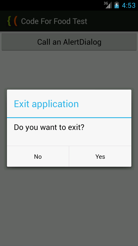
Thanks for reading!
Read more »
There are many types of Dialogs in Android - pop up windows that inform, confirm or request data from the user. Today well take a look at the AlertDialog class - a simple pop up dialog window that can display a title, a text message, and up to 3 buttons - a positive one, a negative one and a neutral one. Its also possible to display more complex things here like lists and switches, but well get to that later.
First, go to the main Activity layout XML and add a button.
<LinearLayout xmlns:android="http://schemas.android.com/apk/res/android"
    xmlns:tools="http://schemas.android.com/tools"
    android:layout_width="match_parent"
    android:layout_height="match_parent"
    android:orientation="vertical"
    tools:context=".MainActivity" >

<Button
    android:id="@+id/testButton"
    android:layout_width="fill_parent"
    android:layout_height="wrap_content"
    android:text="Call an AlertDialog"
    />

</LinearLayout>
Now go to MainActivity.java class. Here, create a reference to the button in the layout and add a click event listener for it.
In the onClick handler function of the listener, well create the AlertDialog. First, declare a builder variable of AlertDialog.Builder class.
AlertDialog.Builder builder = new AlertDialog.Builder(MainActivity.this);
Now we can customize it. I want the dialog window to have 2 buttons - Yes and No, and the Yes button closes the application, while the No button closes just the dialog.
Set the title and message of the dialog:
builder.setTitle("Exit application");
builder.setMessage("Do you want to exit?");
Create a positive button using setPositiveButton() method. It has 2 parameters - label of the button and OnClickListener of the button. We can close the application using MainActivity.this.finish():
builder.setPositiveButton("Yes", new DialogInterface.OnClickListener() {
@Override
public void onClick(DialogInterface dialog, int which) {
MainActivity.this.finish();
}
});
Negative button is created similarly:
builder.setNegativeButton("No", new DialogInterface.OnClickListener() {
@Override
public void onClick(DialogInterface dialog, int which) {
dialog.cancel();
}
});
Then we can make it impossible for the user to close the dialog by pressing "Back" button on their device. Do this using the setCancelable() method:
builder.setCancelable(false);
Create an AlertDialog instance, set its value to builder.create(). Then use show() method of the dialog to display it.
AlertDialog myDialog = builder.create();
myDialog.show();
Full MainActivity.java code:
package com.kircode.codeforfood_test;

import android.app.Activity;
import android.app.AlertDialog;
import android.content.DialogInterface;
import android.os.Bundle;
import android.view.Menu;
import android.view.View;
import android.widget.Button;

public class MainActivity extends Activity{

@Override
protected void onCreate(Bundle savedInstanceState) {
super.onCreate(savedInstanceState);
setContentView(R.layout.activity_main);

Button button = (Button)findViewById(R.id.testButton);

button.setOnClickListener(new View.OnClickListener() {

@Override
public void onClick(View v) {
AlertDialog.Builder builder = new AlertDialog.Builder(MainActivity.this);
builder.setTitle("Exit application");
builder.setMessage("Do you want to exit?");
builder.setPositiveButton("Yes", new DialogInterface.OnClickListener() {
@Override
public void onClick(DialogInterface dialog, int which) {
MainActivity.this.finish();
}
});

builder.setNegativeButton("No", new DialogInterface.OnClickListener() {
@Override
public void onClick(DialogInterface dialog, int which) {
dialog.cancel();
}
});

builder.setCancelable(false);
AlertDialog myDialog = builder.create();
myDialog.show();
}
});
}

@Override
public boolean onCreateOptionsMenu(Menu menu) {
// Inflate the menu; this adds items to the action bar if it is present.
getMenuInflater().inflate(R.menu.activity_main, menu);
return true;
}

}
The results look like this:
Thanks for reading!
Monday, February 2, 2015
Creating EasyTooltip class Part 7
Today well begin working on auto-sizing of our tooltips.
Firstly go to EasyTooltip and add 2 more parameters to receive - the width and height of the parent.
Before that, declare 2 variables - parW and parH:
And then, as said above, receive the parameters and apply their values to parW and parH. Moreover, pass the two varaibles to the TooltipCursor objects constructor.
In TooltipCursor declare 2 new varaibles - parentW and parentH:
Receive and set the values in the constructor:
Now go to updateSize() function.
The first thing well do is calculate the width and height of the tooltip. The width consists of the text width and the left/right text paddings. It is also necessary to add 4 pixels to the width so that the last letter doesnt get cut (some kind of a bug I guess). Similar with the height:
The next 2 lines remain unchanged:
Now here is where it starts to get tricky.
First we check if the tooltip is wide enough to cross the parents boundaries. This is done with an if...statement:
Then we set text fields wordWrap property to true, so that we can break the text into multiple lines:
Calculate the new width by using all the available space from the current mouse coordinate to the left.
Then calculate the height the same way we did before:
All the code above is executed if the width exceeds boundaries. If it doesnt however, we add a while() loop that keeps adding 4 pixels to the width, until the width exceeds the borders.
In the while loop(), after adding the 4 pixels, we also add another check - set wordWrap of the text to false and see if the whole text fits in the visible area. If it does, that means the whole text is fit as one line in the tooltip. Then we can break the while loop and keep that width. Otherwise, set wordWrap back to true and continue:
Full function:
And full code now:
I made an example with 2 visual objects that invoke tooltips:
Thanks for reading!
Read more »
Firstly go to EasyTooltip and add 2 more parameters to receive - the width and height of the parent.
Before that, declare 2 variables - parW and parH:
private var parW:int;
private var parH:int;
And then, as said above, receive the parameters and apply their values to parW and parH. Moreover, pass the two varaibles to the TooltipCursor objects constructor.
/**
 * Create a Tooltip manager. Needed for creating and managing tooltips.
 * @paramparent Reference to the parent of tooltips - the container, which will contain the objects that will be rolled over.
 * @paramparentWidth Width of the parent.
 * @paramparentHeight Height of the parent.
 */

public function EasyTooltip(parent:DisplayObjectContainer, parentWidth:int, parentHeight:int)
{
par = parent;
listeners = [];
parW = parentWidth;
parH = parentHeight;
cursor = new TooltipCursor(parentWidth, parentHeight);
cursor.mouseChildren = false;
cursor.mouseEnabled = false;
parent.addChild(cursor);
cursor.addEventListener(Event.ENTER_FRAME, onFrame);
setStyle(new TooltipStyle());
trace("Tooltip manager created!");
}
In TooltipCursor declare 2 new varaibles - parentW and parentH:
private var parentW:int;
private var parentH:int;
Receive and set the values in the constructor:
public function TooltipCursor(pW:int, pH:int)
{
parentW = pW;
parentH = pH;
txt = new TextField();
txt.multiline = true;
background = new Shape();
addChild(background);
addChild(txt);
}
Now go to updateSize() function.
The first thing well do is calculate the width and height of the tooltip. The width consists of the text width and the left/right text paddings. It is also necessary to add 4 pixels to the width so that the last letter doesnt get cut (some kind of a bug I guess). Similar with the height:
w = txt.textWidth + 4 + style.textPadding.left + style.textPadding.right;
h = txt.textHeight + 4 + style.textPadding.top + style.textPadding.bottom;
The next 2 lines remain unchanged:
actual_x = 0 + style.offsetX;
actual_y = -h + style.offsetY;
Now here is where it starts to get tricky.
First we check if the tooltip is wide enough to cross the parents boundaries. This is done with an if...statement:
// if tooltip sticks out of border - calculate shorted width to fit the content
if (this.x + actual_x + w > parentW) {
Then we set text fields wordWrap property to true, so that we can break the text into multiple lines:
txt.wordWrap = true;
Calculate the new width by using all the available space from the current mouse coordinate to the left.
w = parentW - this.x - actual_x;
Then calculate the height the same way we did before:
h = txt.textHeight + 4 + style.textPadding.top + style.textPadding.bottom;
All the code above is executed if the width exceeds boundaries. If it doesnt however, we add a while() loop that keeps adding 4 pixels to the width, until the width exceeds the borders.
In the while loop(), after adding the 4 pixels, we also add another check - set wordWrap of the text to false and see if the whole text fits in the visible area. If it does, that means the whole text is fit as one line in the tooltip. Then we can break the while loop and keep that width. Otherwise, set wordWrap back to true and continue:
}else {
// if doesnt stick out, keep adding 4 pixels to the width until as much text is seen as possible
while (this.x + actual_x + w < parentW) {
w += 4;
// try turning off wordwrap and see if it still fits (as one line)
txt.wordWrap = false;
if (w > txt.textWidth + 4 + style.textPadding.left + style.textPadding.right) {
w = txt.textWidth + 4 + style.textPadding.left + style.textPadding.right;
break;
}
txt.wordWrap = true;
}

}
Full function:
private function updateSize():void {
w = txt.textWidth + 4 + style.textPadding.left + style.textPadding.right;
h = txt.textHeight + 4 + style.textPadding.top + style.textPadding.bottom;
actual_x = 0 + style.offsetX;
actual_y = -h + style.offsetY;

// if tooltip sticks out of border - calculate shorted width to fit the content
if (this.x + actual_x + w > parentW) {
txt.wordWrap = true;
w = parentW - this.x - actual_x;
h = txt.textHeight + 4 + style.textPadding.top + style.textPadding.bottom;
}else {
// if doesnt stick out, keep adding 4 pixels to the width until as much text is seen as possible
while (this.x + actual_x + w < parentW) {
w += 4;
// try turning off wordwrap and see if it still fits (as one line)
txt.wordWrap = false;
if (w > txt.textWidth + 4 + style.textPadding.left + style.textPadding.right) {
w = txt.textWidth + 4 + style.textPadding.left + style.textPadding.right;
break;
}
txt.wordWrap = true;
}

}
}
And full code now:
package com.kircode.EasyTooltip
{
import flash.display.MovieClip;
import flash.display.Shape;
import flash.text.TextField;
import flash.text.TextFormat;
/**
 * The cursor that follows the mouse (if not set otherwise) and displays each tooltip.
 * @author Kirill Poletaev
 */
public class TooltipCursor extends MovieClip
{

public var txt:TextField;
private var style:TooltipStyle;
private var background:Shape;
private var w:int;
private var h:int;
private var actual_x:int;
private var actual_y:int;
private var parentW:int;
private var parentH:int;

public function TooltipCursor(pW:int, pH:int)
{
parentW = pW;
parentH = pH;
txt = new TextField();
txt.multiline = true;
background = new Shape();
addChild(background);
addChild(txt);
}

/**
 * Set style of the tooltips.
 * @paramst TooltipStyle object to apply.
 */

public function setStyle(st:TooltipStyle):void {
style = st;
}

/**
 * Change the text value of the tooltip.
 * @parammessage The new text value.
 */

public function setText(message:String):void {
txt.text = message;
txt.setTextFormat(style.textFormat);
updateSize();
updateDisplay();
}

private function updateDisplay():void {
background.graphics.clear();
background.graphics.beginFill(style.backgroundColor, style.backgroundAlpha);
background.graphics.drawRect(actual_x, actual_y, w, h);
background.graphics.endFill();

txt.width = w - style.textPadding.left - style.textPadding.right;
txt.height = h - style.textPadding.top - style.textPadding.bottom;
txt.x = actual_x + style.textPadding.left;
txt.y = actual_y + style.textPadding.top;
}

private function updateSize():void {
w = txt.textWidth + 4 + style.textPadding.left + style.textPadding.right;
h = txt.textHeight + 4 + style.textPadding.top + style.textPadding.bottom;
actual_x = 0 + style.offsetX;
actual_y = -h + style.offsetY;

// if tooltip sticks out of border - calculate shorted width to fit the content
if (this.x + actual_x + w > parentW) {
txt.wordWrap = true;
w = parentW - this.x - actual_x;
h = txt.textHeight + 4 + style.textPadding.top + style.textPadding.bottom;
}else {
// if doesnt stick out, keep adding 4 pixels to the width until as much text is seen as possible
while (this.x + actual_x + w < parentW) {
w += 4;
// try turning off wordwrap and see if it still fits (as one line)
txt.wordWrap = false;
if (w > txt.textWidth + 4 + style.textPadding.left + style.textPadding.right) {
w = txt.textWidth + 4 + style.textPadding.left + style.textPadding.right;
break;
}
txt.wordWrap = true;
}

}
}

}

}
I made an example with 2 visual objects that invoke tooltips:
tooltip = new EasyTooltip(stage, stage.stageWidth, stage.stageHeight);
tooltip.addListener(object1, "This is an object.");
tooltip.addListener(object2, "This is a piece of a longer text. It should fit in the visible area.");
Thanks for reading!
Friday, January 30, 2015
AdvAlert AS3 class Download and How To Use Part 7
Today Ill show you how to create a simple skin set.
By skin set I mean a few skins of the same design, but different functionality and goal.
For example, today well create 3 skins of one design for warning messages, information messages, and confirmation windows.
You can see the final results in the end of this tutorial.
The source code for todays tutorial can be found here.
You can unpack the package now and look at the contents. Youll see that the AdvAlert class is stored in the com folder, and there are 3 pictures and 2 sounds in the rsrc folder. The code of the example is in main.as file of the root folder.
The pictures and sounds from the rsrc folder are embedded into the final swf file. You can see that embedding resources and using them as dynamic content does not require you to use Flash IDE.
I will now explain what each part of main.as code does.
You can see that the first thing we do is declare the essential variables. Theres only one in this case - AlertManager:
Then we embed each resource:
And then we declare 6 variables for 3 skins:
In the init() function we first set AlertManager to a new AdvAlertManager:
And then proceed to stylize the 3 skins:
I also have this bit of code that just displays the alert windows as an example, one after another (with some interaction involved). This code functions called confirm, warn, and info, which we will create shortly.
Then we create 3 functions - warn, info and confirm, which use the 3 different skins:
And thats it! Now we can use these handy alert windows of different types in games and applications with minimum number of lines.
Using this principle, you can create your own skin sets and introduce new window types.
Thanks for reading!
Read more »
By skin set I mean a few skins of the same design, but different functionality and goal.
For example, today well create 3 skins of one design for warning messages, information messages, and confirmation windows.
You can see the final results in the end of this tutorial.
The source code for todays tutorial can be found here.
You can unpack the package now and look at the contents. Youll see that the AdvAlert class is stored in the com folder, and there are 3 pictures and 2 sounds in the rsrc folder. The code of the example is in main.as file of the root folder.
The pictures and sounds from the rsrc folder are embedded into the final swf file. You can see that embedding resources and using them as dynamic content does not require you to use Flash IDE.
I will now explain what each part of main.as code does.
You can see that the first thing we do is declare the essential variables. Theres only one in this case - AlertManager:
// Essential variables
private var AlertManager:AdvAlertManager;
Then we embed each resource:
// Embedded resources
[Embed(source = "rsrc/warning.png")]
private var warning_icon:Class;
[Embed(source = "rsrc/info.png")]
private var info_icon:Class;
[Embed(source = "rsrc/confirm.png")]
private var confirm_icon:Class;
[Embed(source = "rsrc/critical.mp3")]
private var warning_sound:Class;
[Embed(source = "rsrc/info.mp3")]
private var info_sound:Class;
And then we declare 6 variables for 3 skins:
// Skins
private var skin_warning:AdvAlertSkin = new AdvAlertSkin();
private var buttonskin_warning:AdvAlertButtonSkin = new AdvAlertButtonSkin();
private var skin_info:AdvAlertSkin = new AdvAlertSkin();
private var buttonskin_info:AdvAlertButtonSkin = new AdvAlertButtonSkin();
private var skin_confirm:AdvAlertSkin = new AdvAlertSkin();
private var buttonskin_confirm:AdvAlertButtonSkin = new AdvAlertButtonSkin();
In the init() function we first set AlertManager to a new AdvAlertManager:
// Declare AlertManager
AlertManager = new AdvAlertManager(this, stage, null, null, null, true, 300, 0, 160);
And then proceed to stylize the 3 skins:
// Warning skin
skin_warning.bgRect = new SolidColorRect(0xe2e2e2, [5, 5, 5, 5], 1);
skin_warning.bgStroke = new SolidColorStroke(1, 0x000000, 0);
skin_warning.headerHeight = 34;
skin_warning.headerRect = new SolidColorRect(0x99ccff, [5, 5, 0, 0], 1);
skin_warning.headerPadding = new TextPadding(0, 0, 0, 0);
skin_warning.titleFormat = new TextFormat("Verdana", 22, 0xffffff);
skin_warning.titleFilters = [new DropShadowFilter(1, 45, 0x000000, 0.7, 0, 0)];
skin_warning.textFormat = new TextFormat("Verdana", 15, 0x111111);
skin_warning.blurColor = 0x000000;
skin_warning.buttonbarPadding.bottom = 0;
skin_warning.addContent(warning_icon, new Point(5, 40));
skin_warning.textPadding = new TextPadding(5, 5, 5, 125);
buttonskin_warning.bgRect = new SolidColorRect(0x99ccff, [5, 5, 0, 0], 1);
buttonskin_warning.bgStroke = new SolidColorStroke(1, 0x000000, 0);
buttonskin_warning.textFormat = new TextFormat("Verdana", 17, 0xffffff, null, null, null, null, null, "center" );
buttonskin_warning.textFilters = [new DropShadowFilter(1, 45, 0x000000, 0.7, 0, 0)];
buttonskin_warning.hover_bgRect = new SolidColorRect(0x7799bb, [5, 5, 0, 0], 1);
buttonskin_warning.hover_bgStroke = new SolidColorStroke(1, 0x000000, 0);
buttonskin_warning.hover_textFormat = new TextFormat("Verdana", 17, 0xffffff, null, null, null, null, null, "center" );
buttonskin_warning.hover_textFilters = [new DropShadowFilter(1, 45, 0x000000, 0.7, 0, 0)];

// Information skin
skin_info.bgRect = new SolidColorRect(0xe2e2e2, [5, 5, 5, 5], 1);
skin_info.bgStroke = new SolidColorStroke(1, 0x000000, 0);
skin_info.headerHeight = 34;
skin_info.headerRect = new SolidColorRect(0x99ccff, [5, 5, 0, 0], 1);
skin_info.headerPadding = new TextPadding(0, 0, 0, 0);
skin_info.titleFormat = new TextFormat("Verdana", 22, 0xffffff);
skin_info.titleFilters = [new DropShadowFilter(1, 45, 0x000000, 0.7, 0, 0)];
skin_info.textFormat = new TextFormat("Verdana", 15, 0x111111);
skin_info.blurColor = 0x000000;
skin_info.buttonbarPadding.bottom = 0;
skin_info.addContent(info_icon, new Point(5, 40));
skin_info.textPadding = new TextPadding(5, 5, 5, 125);
buttonskin_info.bgRect = new SolidColorRect(0x99ccff, [5, 5, 0, 0], 1);
buttonskin_info.bgStroke = new SolidColorStroke(1, 0x000000, 0);
buttonskin_info.textFormat = new TextFormat("Verdana", 17, 0xffffff, null, null, null, null, null, "center" );
buttonskin_info.textFilters = [new DropShadowFilter(1, 45, 0x000000, 0.7, 0, 0)];
buttonskin_info.hover_bgRect = new SolidColorRect(0x7799bb, [5, 5, 0, 0], 1);
buttonskin_info.hover_bgStroke = new SolidColorStroke(1, 0x000000, 0);
buttonskin_info.hover_textFormat = new TextFormat("Verdana", 17, 0xffffff, null, null, null, null, null, "center" );
buttonskin_info.hover_textFilters = [new DropShadowFilter(1, 45, 0x000000, 0.7, 0, 0)];

// Confirmation skin
skin_confirm.bgRect = new SolidColorRect(0xe2e2e2, [5, 5, 5, 5], 1);
skin_confirm.bgStroke = new SolidColorStroke(1, 0x000000, 0);
skin_confirm.headerHeight = 34;
skin_confirm.headerRect = new SolidColorRect(0x99ccff, [5, 5, 0, 0], 1);
skin_confirm.headerPadding = new TextPadding(0, 0, 0, 0);
skin_confirm.titleFormat = new TextFormat("Verdana", 22, 0xffffff);
skin_confirm.titleFilters = [new DropShadowFilter(1, 45, 0x000000, 0.7, 0, 0)];
skin_confirm.textFormat = new TextFormat("Verdana", 15, 0x111111);
skin_confirm.blurColor = 0x000000;
skin_confirm.buttonbarPadding.bottom = 0;
skin_confirm.addContent(confirm_icon, new Point(5, 40));
skin_confirm.textPadding = new TextPadding(5, 5, 5, 125);
buttonskin_confirm.bgRect = new SolidColorRect(0x99ccff, [5, 5, 0, 0], 1);
buttonskin_confirm.bgStroke = new SolidColorStroke(1, 0x000000, 0);
buttonskin_confirm.textFormat = new TextFormat("Verdana", 17, 0xffffff, null, null, null, null, null, "center" );
buttonskin_confirm.textFilters = [new DropShadowFilter(1, 45, 0x000000, 0.7, 0, 0)];
buttonskin_confirm.hover_bgRect = new SolidColorRect(0x7799bb, [5, 5, 0, 0], 1);
buttonskin_confirm.hover_bgStroke = new SolidColorStroke(1, 0x000000, 0);
buttonskin_confirm.hover_textFormat = new TextFormat("Verdana", 17, 0xffffff, null, null, null, null, null, "center" );
buttonskin_confirm.hover_textFilters = [new DropShadowFilter(1, 45, 0x000000, 0.7, 0, 0)];
I also have this bit of code that just displays the alert windows as an example, one after another (with some interaction involved). This code functions called confirm, warn, and info, which we will create shortly.
// Test different window types
var timer:Timer = new Timer(1000, 1);
timer.addEventListener(TimerEvent.TIMER, onTimer);
timer.start();
function onTimer(evt:TimerEvent):void {
warn("The specified E-mail address is not valid!", "Warning!", closeWarn);
}
function closeWarn(response:String):void {
confirm("Are you sure you want to exit?", "Confirmation", onYes, onNo);
}
function onYes():void {
info("You answered Yes!", "Notice!");
}
function onNo():void {
info("You answered No!", "Notice!");
}
Then we create 3 functions - warn, info and confirm, which use the 3 different skins:
public function warn(message:String, title:String, handler:Function = null):void {
var warnSound:Sound = new warning_sound();
AlertManager.reset(this, stage, skin_warning, buttonskin_warning, warnSound, true, 300, 0, 160);
AlertManager.alert(message, title, null, 0, handler);
}

public function info(message:String, title:String):void {
var infoSound:Sound = new info_sound();
AlertManager.reset(this, stage, skin_info, buttonskin_info, infoSound, true, 300, 0, 160);
AlertManager.alert(message, title);
}

public function confirm(message:String, title:String, handlerYes:Function = null, handlerNo:Function = null):void {
var infoSound:Sound = new info_sound();
AlertManager.reset(this, stage, skin_confirm, buttonskin_confirm, infoSound, true, 300, 0, 160);
AlertManager.alert(message, title, [new AdvAlertButton("Yes"), new AdvAlertButton("No")], 0, handler);
function handler(response:String):void {
if (response == "Yes") handlerYes.call();
if (response == "No") handlerNo.call();
}
}
And thats it! Now we can use these handy alert windows of different types in games and applications with minimum number of lines.
Using this principle, you can create your own skin sets and introduce new window types.
Thanks for reading!
Wednesday, January 28, 2015
Creating Advanced Alert Window class Part 4
In this tutorial we will add more skinning options to the alert window.
Go to AdvAlertWindow.as and declare more variables:
The titlePadding variable will be used to create padding for the title text field inside the header box. Right now we have padding for header box only, which moves the header and the title together. Adding this variable will mean that we will also be able to tweak position of the title inside the header.
The titleFormat and textFormat objects are used for formatting the title and body text.
The selectable boolean will determine whether the text is selectable or not.
Go to the constructor and lets update the window skinning part.
Firstly, well get rid of lines that call setPadding() methods of TextPadding objects. Instead, well pass the padding values to the constructor.
Next lets set up some text formatting.
Then we set selectable to false.
Full constructor:
Now go to updateDraw() function. In the lines that set x and y coordinates of titleField, add titlePaddings left and top values.
Set text formats of textField and titleField to textFormat and titleFormat. Also set their selectable values to selectable variable value.
Full AdvAlertWindow.as code:
Go to TextPadding.as and update it to be able to pass padding values in the constructor:
And thats all for today.
Thanks for reading!
Read more »
Go to AdvAlertWindow.as and declare more variables:
private var titlePadding:TextPadding;
private var titleFormat:TextFormat;
private var textFormat:TextFormat;
private var selectable:Boolean;
The titlePadding variable will be used to create padding for the title text field inside the header box. Right now we have padding for header box only, which moves the header and the title together. Adding this variable will mean that we will also be able to tweak position of the title inside the header.
The titleFormat and textFormat objects are used for formatting the title and body text.
The selectable boolean will determine whether the text is selectable or not.
Go to the constructor and lets update the window skinning part.
Firstly, well get rid of lines that call setPadding() methods of TextPadding objects. Instead, well pass the padding values to the constructor.
textPadding = new TextPadding(5, 5, 5, 5);
headerPadding = new TextPadding(5, 5, 5, 5);
titlePadding = new TextPadding(2, 2, 2, 2);
Next lets set up some text formatting.
titleFormat = new TextFormat();
titleFormat.size = 20;
titleFormat.font = "Arial";
titleFormat.bold = true;
textFormat = new TextFormat();
textFormat.size = 16;
textFormat.font = "Arial";
Then we set selectable to false.
selectable = false;
Full constructor:
public function AdvAlertWindow(pt:String, ptt:String, pw:int, ph:int, ppos:Point)
{
t = pt;
tt = ptt;
w = pw;
h = ph;
pos = ppos;

// skinning
textPadding = new TextPadding(5, 5, 5, 5);
headerPadding = new TextPadding(5, 5, 5, 5);
titlePadding = new TextPadding(2, 2, 2, 2);
headerHeight = 30;
titleFormat = new TextFormat();
titleFormat.size = 20;
titleFormat.font = "Arial";
titleFormat.bold = true;
textFormat = new TextFormat();
textFormat.size = 16;
textFormat.font = "Arial";
selectable = false;

textField = new TextField();
addChild(textField);

titleField = new TextField();
addChild(titleField);

updateDraw();
}
Now go to updateDraw() function. In the lines that set x and y coordinates of titleField, add titlePaddings left and top values.
Set text formats of textField and titleField to textFormat and titleFormat. Also set their selectable values to selectable variable value.
public function updateDraw():void {
// bg
this.graphics.clear();
this.graphics.beginFill(0xcccccc, 1);
this.graphics.drawRect(pos.x, pos.y, w, h);
this.graphics.endFill();
// header
this.graphics.beginFill(0xeeeeee, 1);
this.graphics.drawRect(pos.x + headerPadding.left, pos.y + headerPadding.top, w - (headerPadding.left + headerPadding.right), headerHeight);
this.graphics.endFill();
// title
titleField.width = w - (headerPadding.left + headerPadding.right);
titleField.text = tt;
titleField.height = headerHeight;
titleField.x = pos.x + headerPadding.left + titlePadding.left;
titleField.y = pos.y + headerPadding.top + titlePadding.top;
// text
textField.width = w - (textPadding.right + textPadding.left);
textField.height = h - (textPadding.top + textPadding.bottom + headerPadding.top + headerPadding.bottom + headerHeight);
textField.text = t;
textField.x = pos.x + textPadding.right;
textField.y = pos.y + textPadding.top + headerHeight + headerPadding.bottom + headerPadding.top;
// formats
textField.setTextFormat(textFormat);
titleField.setTextFormat(titleFormat);
textField.selectable = selectable;
titleField.selectable = selectable;
}
Full AdvAlertWindow.as code:
package com.kircode
{
import flash.display.MovieClip;
import flash.geom.Point;
import flash.text.TextField;
import flash.text.TextFormat;
import flash.display.GradientType;

/**
 * Advanced Alert window object.
 * @author Kirill Poletaev
 */
public class AdvAlertWindow extends MovieClip
{
private var t:String;
private var tt:String;
private var w:int;
private var h:int;
private var pos:Point;

private var textField:TextField;
private var titleField:TextField;

private var textPadding:TextPadding;
private var headerPadding:TextPadding;
private var titlePadding:TextPadding;
private var headerHeight:int;
private var titleFormat:TextFormat;
private var textFormat:TextFormat;
private var selectable:Boolean;

public function AdvAlertWindow(pt:String, ptt:String, pw:int, ph:int, ppos:Point)
{
t = pt;
tt = ptt;
w = pw;
h = ph;
pos = ppos;

// skinning
textPadding = new TextPadding(5, 5, 5, 5);
headerPadding = new TextPadding(5, 5, 5, 5);
titlePadding = new TextPadding(2, 2, 2, 2);
headerHeight = 30;
titleFormat = new TextFormat();
titleFormat.size = 20;
titleFormat.font = "Arial";
titleFormat.bold = true;
textFormat = new TextFormat();
textFormat.size = 16;
textFormat.font = "Arial";
selectable = false;

textField = new TextField();
addChild(textField);

titleField = new TextField();
addChild(titleField);

updateDraw();
}

public function updateDraw():void {
// bg
this.graphics.clear();
this.graphics.beginFill(0xcccccc, 1);
this.graphics.drawRect(pos.x, pos.y, w, h);
this.graphics.endFill();
// header
this.graphics.beginFill(0xeeeeee, 1);
this.graphics.drawRect(pos.x + headerPadding.left, pos.y + headerPadding.top, w - (headerPadding.left + headerPadding.right), headerHeight);
this.graphics.endFill();
// title
titleField.width = w - (headerPadding.left + headerPadding.right);
titleField.text = tt;
titleField.height = headerHeight;
titleField.x = pos.x + headerPadding.left + titlePadding.left;
titleField.y = pos.y + headerPadding.top + titlePadding.top;
// text
textField.width = w - (textPadding.right + textPadding.left);
textField.height = h - (textPadding.top + textPadding.bottom + headerPadding.top + headerPadding.bottom + headerHeight);
textField.text = t;
textField.x = pos.x + textPadding.right;
textField.y = pos.y + textPadding.top + headerHeight + headerPadding.bottom + headerPadding.top;
// formats
textField.setTextFormat(textFormat);
titleField.setTextFormat(titleFormat);
textField.selectable = selectable;
titleField.selectable = selectable;
}

}

}
Go to TextPadding.as and update it to be able to pass padding values in the constructor:
package com.kircode
{
/**
 * ...
 * @author Kirill Poletaev
 */
public class TextPadding
{
public var left:int = 5;
public var right:int = 5;
public var top:int = 5;
public var bottom:int = 5;

/**
 * Padding values of a text field. All default values are 5.
 * @paramtopPadding Top padding of the text field.
 * @paramrightPadding Right padding of the text field.
 * @parambottomPadding Bottom padding of the text field.
 * @paramleftPadding Left padding of the text field.
 */

public function TextPadding(topPadding:int = 5, rightPadding:int = 5, bottomPadding:int = 5, leftPadding:int = 5)
{
top = topPadding;
right = rightPadding;
bottom = bottomPadding;
left = leftPadding;
}

/**
 * Padding values of a text field. All default values are 5.
 * @paramtopPadding Top padding of the text field.
 * @paramrightPadding Right padding of the text field.
 * @parambottomPadding Bottom padding of the text field.
 * @paramleftPadding Left padding of the text field.
 */

public function setPadding(topPadding:int, rightPadding:int, bottomPadding:int, leftPadding:int):void {
top = topPadding;
right = rightPadding;
bottom = bottomPadding;
left = leftPadding;
}

}

}
And thats all for today.
Thanks for reading!
Tuesday, January 27, 2015
Creating Advanced Alert Window class Part 1
Today we will start working on an advanced alert manager class for AS3.
The idea behind this tutorial series is to create a flexible AS3 class for displaying alert messages to the users.
The closest thing to this is the Alert class for Flex - however, I think it still lacks a few things. This is why I am writing this class and these articles - to create an universal and customizable class that would provide the developers with ability to quickly implement alert/notice/warning windows in their application.
If you have any additions to the code I provide, have any suggestions or questions - leave a comment. I hope you will find this series useful!
So, lets begin.
Im using FlashDevelop for writing the class, but Ill also use Flash for debugging. The class itself is just a folder of as3 files, but they alone are not viewable without an environment. Thats why well create a new AS3 project as a testing area for our class.
Im using Flash to create a new project and set its main class path to "main" (located under Publish tab in the tool panel). You can, of course, use FlashDevelop or any other IDE to do this.
Next to the Flash file Ill create a new class main.as.
Make the class extend MovieClip and declare a new variable called AlertManager. Set its type to AdvAlertManager. Import com.kircode.AdvAlertManager class. In the constructor, add a listener for ADDED_TO_STAGE event, set its handler to init() function.
In init(), set AlertManager to a new instance of AdvAlertManager. Call its alert() method to display a simple message.
Now create a new folder "com", inside of it add a folder "kircode", and there add a new class callde AdvAlertManager.as:

The class for now will only have a constructor that traces a message that an instance of this class has been created, and a public function alert().
The alert() function will later open a real alert window, but for now let it just trace the message:
And thats all for today!
Its not much yet, but the basis is there.
Thanks for reading!
Read more »
The idea behind this tutorial series is to create a flexible AS3 class for displaying alert messages to the users.
The closest thing to this is the Alert class for Flex - however, I think it still lacks a few things. This is why I am writing this class and these articles - to create an universal and customizable class that would provide the developers with ability to quickly implement alert/notice/warning windows in their application.
If you have any additions to the code I provide, have any suggestions or questions - leave a comment. I hope you will find this series useful!
So, lets begin.
Im using FlashDevelop for writing the class, but Ill also use Flash for debugging. The class itself is just a folder of as3 files, but they alone are not viewable without an environment. Thats why well create a new AS3 project as a testing area for our class.
Im using Flash to create a new project and set its main class path to "main" (located under Publish tab in the tool panel). You can, of course, use FlashDevelop or any other IDE to do this.
Next to the Flash file Ill create a new class main.as.
Make the class extend MovieClip and declare a new variable called AlertManager. Set its type to AdvAlertManager. Import com.kircode.AdvAlertManager class. In the constructor, add a listener for ADDED_TO_STAGE event, set its handler to init() function.
In init(), set AlertManager to a new instance of AdvAlertManager. Call its alert() method to display a simple message.
package
{
import com.kircode.AdvAlertManager;
import flash.display.MovieClip;
import flash.events.Event;
/**
 * ...
 * @author Kirill Poletaev
 */
public class main extends MovieClip
{
private var AlertManager:AdvAlertManager;

public function main()
{
addEventListener(Event.ADDED_TO_STAGE, init);
}

private function init(evt:Event):void {
AlertManager = new AdvAlertManager();
AlertManager.alert("This is a test message!");
}

}

}
Now create a new folder "com", inside of it add a folder "kircode", and there add a new class callde AdvAlertManager.as:
The class for now will only have a constructor that traces a message that an instance of this class has been created, and a public function alert().
The alert() function will later open a real alert window, but for now let it just trace the message:
package com.kircode
{
/**
 * Advanced Alert window manager.
 * @author Kirill Poletaev
 */
public class AdvAlertManager
{

public function AdvAlertManager()
{
trace(":AdvAlertManager instance created.");
}

public function alert(text:String):void {
trace("Message: " + text);
}

}

}
And thats all for today!
Its not much yet, but the basis is there.
Thanks for reading!
Subscribe to:
Posts (Atom)