Wednesday, January 28, 2015
CSS3 Rounded Corners and Box Shadows Example
In this tutorial we going to take look of some nice features in CSS3 provide rounded corners, drop shadows and few new color management features. It doesn’t matter if your are developer or designer at the end of the day our job is basically same we have to create rich, usable website and web application with an awesome user experience.
First we will see how to create rounded corner. Rounded corners are nothing but rounds the corner(s) of an element with a defined radius value. I have taken three div tags and each div has a different border class . Look at the top div the border radius property is 20px and applied same pixel to all the four corners. We can also specify amount in percentage for example 1%. If you want to define different border radius on each corner look the second div and last div contains the individual border property.
 div {
      font-family: verdana, arial;
      font-size: small;
      padding: 10px;
      width: 400px;
      height: 50px;
      background-color: orange;
    }

    .borderEffect1 {
      border-radius: 20px;
    }

    .borderEffect2 {
      /* top-left top-right bottom-right bottom-left */
      border-radius: 10px 50px 10px 0px;
    }

    .borderEffect3 {
      border-top-left-radius: 10px;
      border-top-right-radius: 50px;
      border-bottom-right-radius: 10px;
      border-bottom-left-radius: 0px;
    }

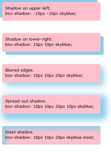
Box shadow is a new property in CSS3. It takes five values horizontal offset the positive number means up shadow and negative number means down shadow, vertical offset, blur distance, spread distance, color, and inset. I have taken series of div tags and applied shadow class for each div.
 div {
      font-family: verdana, arial;
      font-size: small;
      padding: 10px;
      width: 300px;
      height: 40px;
      background-color: pink;
      border-radius: 5px;
    }

    .dropShadow1 {
      box-shadow: -10px -10px skyblue;
    }

    .dropShadow2 {
      box-shadow: 10px 10px skyblue;
    }

    .dropShadow3 {
      box-shadow: 10px 10px 20px skyblue;
    }

    .dropShadow4 {
      box-shadow: 10px 10px 20px 10px skyblue;
    }

    .dropShadow5 {
      box-shadow: 10px 10px 20px skyblue inset;
    }
 |

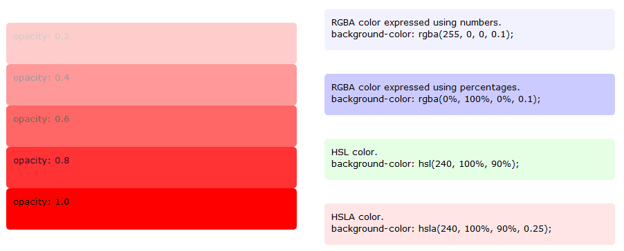
Color management is the new way to specify colors in CSS3. We have rgba or rgb and hsla or hsl function. RGBA is used to specify the colors red, blue, green and opacity. HSLA is used to specify Hue, Saturation, Lightness. RGBA and HSLA colors expressed using percentages or numbers. Once check the code in below example.
Opacity is another property in CSS3 used to set opacity.
div {
      font-family: verdana, arial;
      font-size: small;
      padding: 10px;
      width: 400px;
      height: 40px;
      border-radius: 5px;
    }

  .colorOpacity1 {
      background-color: rgba(255, 0, 0, 0.1);
    }

    .colorOpacity2 {
      background-color: rgba(0%, 100%, 0%, 0.1);
    }

    .colorOpacity3 {
      background-color: hsl(240, 100%, 90%);
    }

    .colorOpacity4 {
      background-color: hsla(240, 100%, 90%, 0.25);
    }
<div style="background: red; opacity: 0.0;">opacity: 0.0</div>
<div style="background: red; opacity: 0.2;">opacity: 0.2</div>
<div style="background: red; opacity: 0.4;">opacity: 0.4</div>
<div style="background: red; opacity: 0.6;">opacity: 0.6</div>
<div style="background: red; opacity: 0.8;">opacity: 0.8</div>
<div style="background: red; opacity: 1.0;">opacity: 1.0</div>
Subscribe to:
Post Comments (Atom)
No comments:
Post a Comment
Note: Only a member of this blog may post a comment.